TYPE: BRANDING, PACKAGING DESIGN
DESIGNER: YONG WU
YEAR: 2019
CLIENT: KO-U SAKE
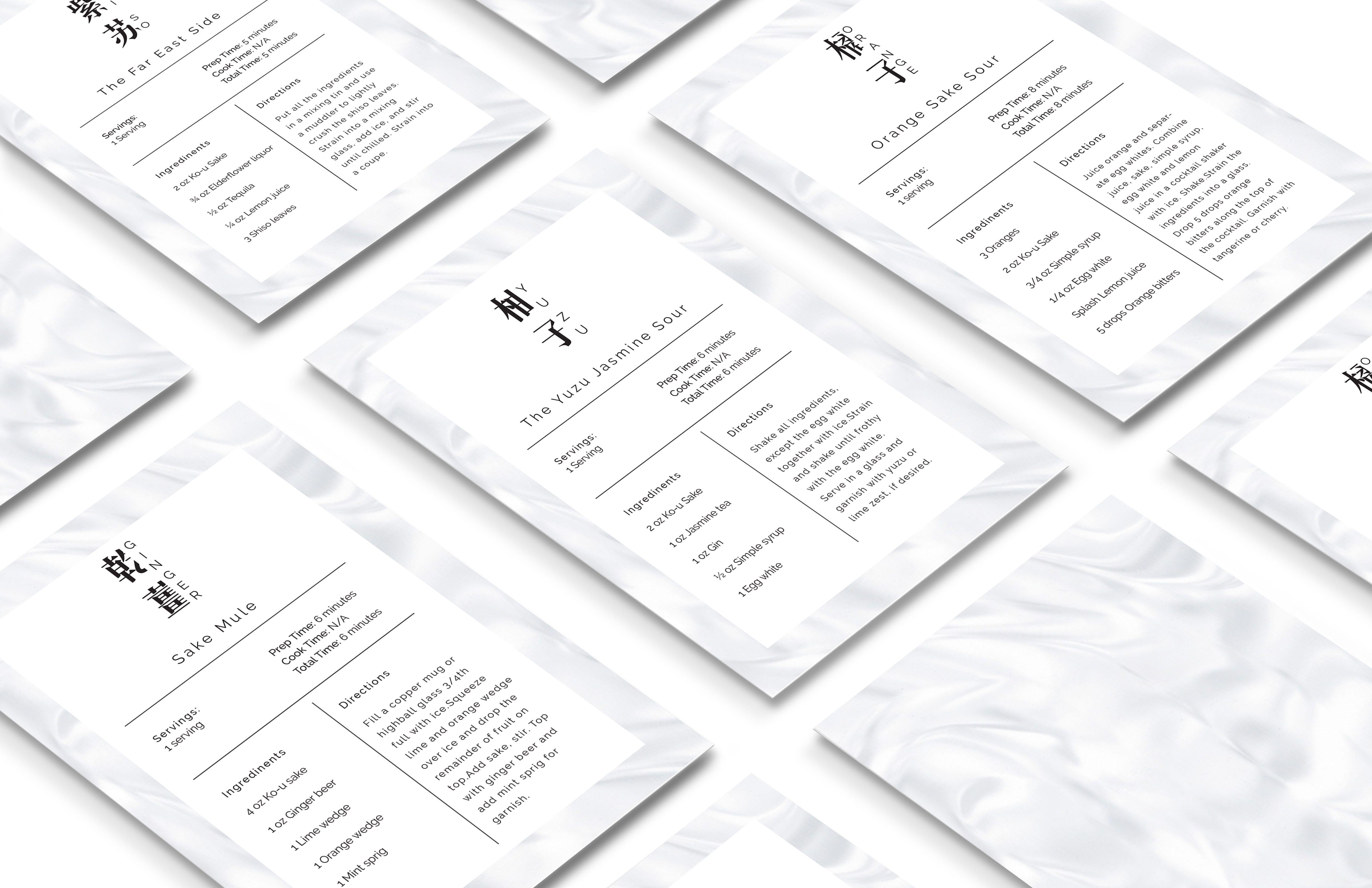
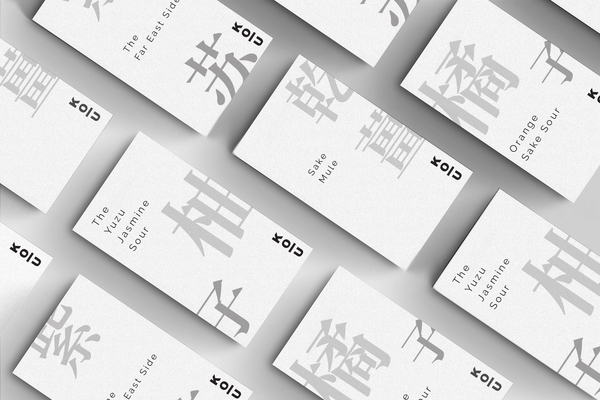
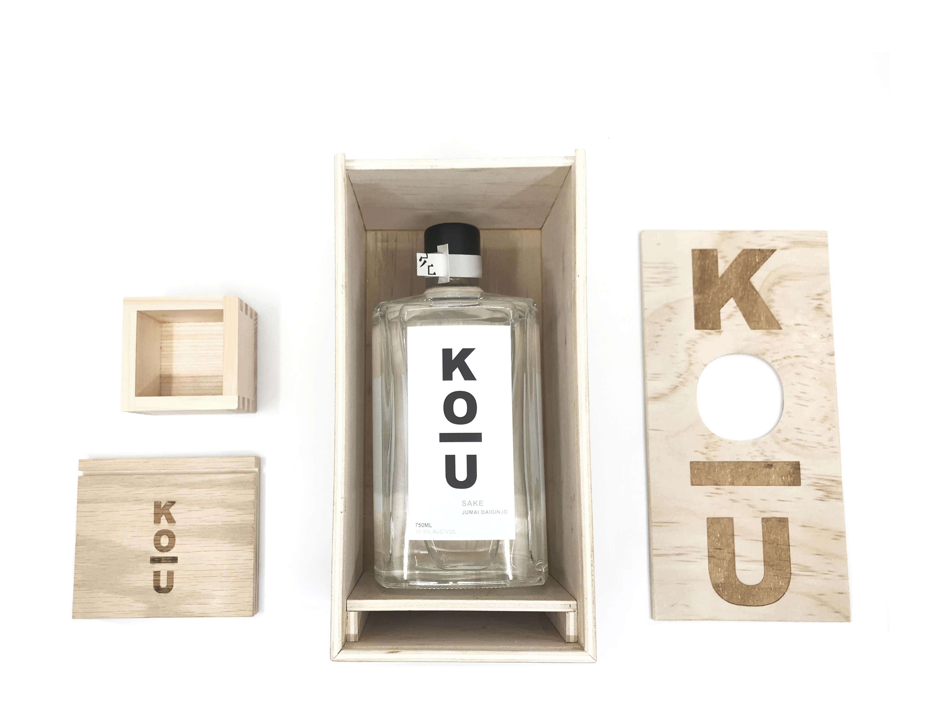
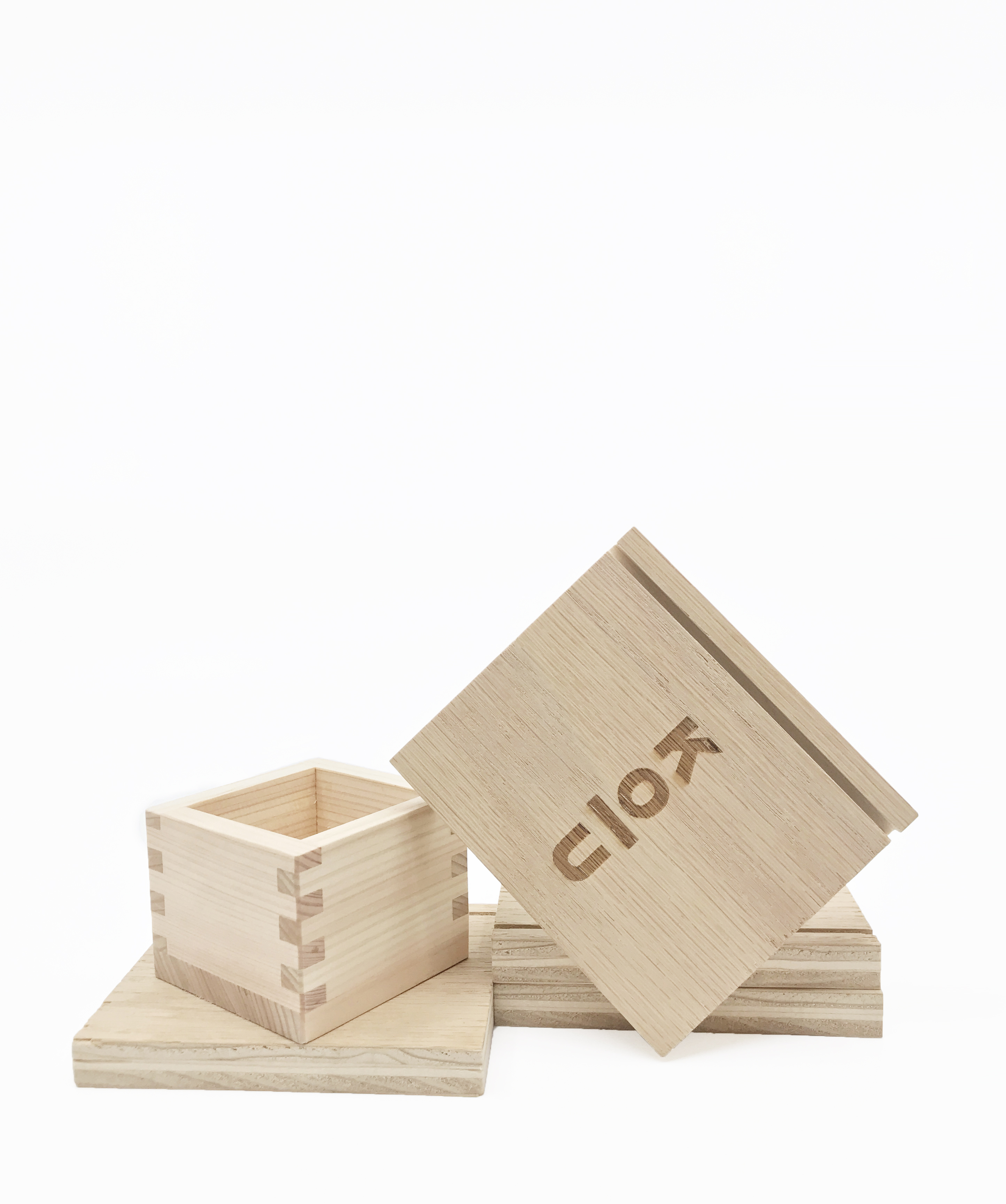
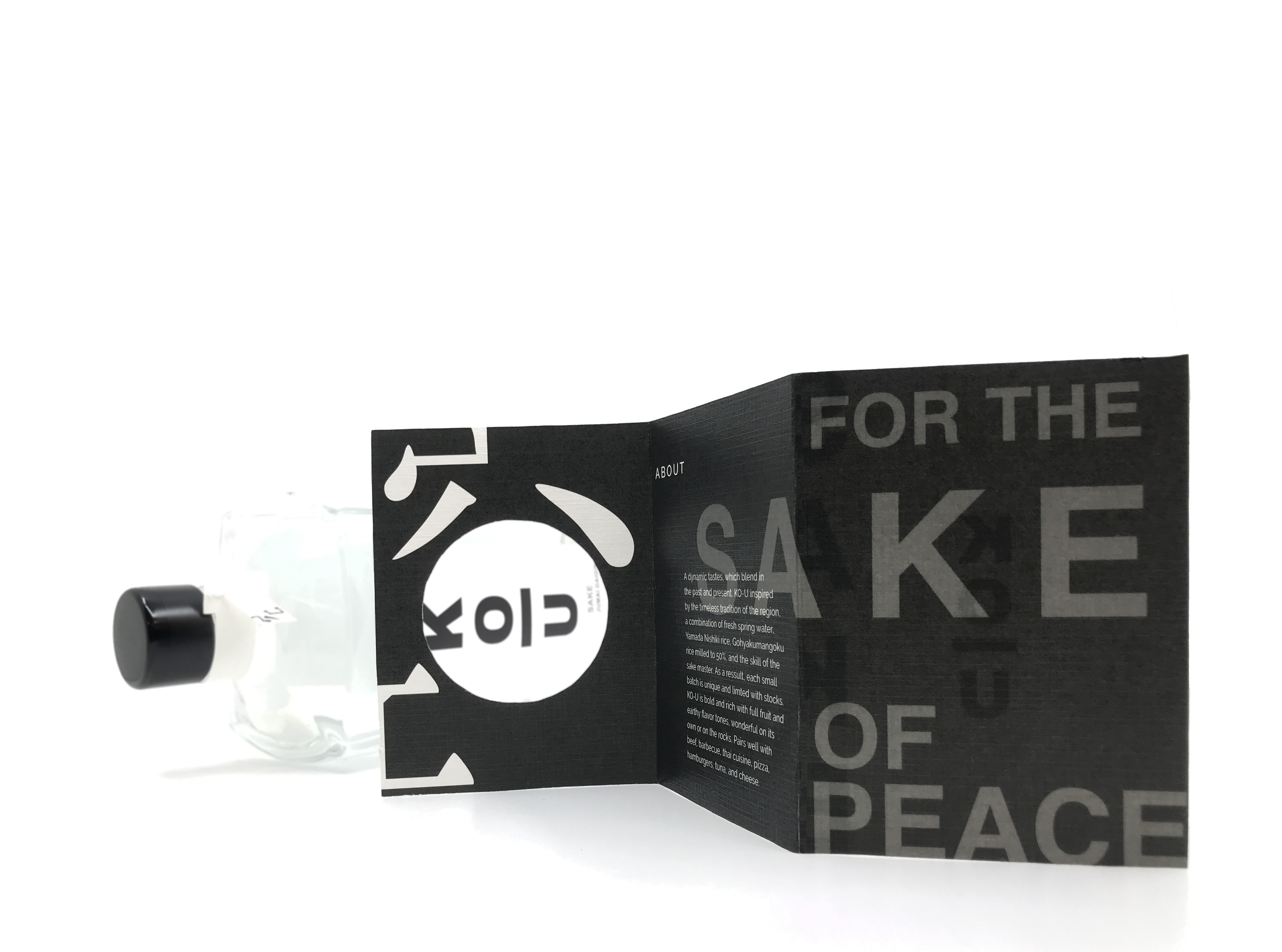
The branding design for this project aims to create a modern and minimalist logo that redefines the traditional image of sake. Sake is often perceived as an old and traditional beverage, typically associated with heritage and formality. Through this design, I want to challenge that perception by introducing a fresh visual identity that resonates with a younger generation. The goal is to develop a logo and packaging that are clean, contemporary, and eye-catching—inviting a new audience to experience sake in a modern context while still honoring its cultural roots.
DESIGNER: YONG WU
YEAR: 2019
CLIENT: KO-U SAKE
The branding design for this project aims to create a modern and minimalist logo that redefines the traditional image of sake. Sake is often perceived as an old and traditional beverage, typically associated with heritage and formality. Through this design, I want to challenge that perception by introducing a fresh visual identity that resonates with a younger generation. The goal is to develop a logo and packaging that are clean, contemporary, and eye-catching—inviting a new audience to experience sake in a modern context while still honoring its cultural roots.